


There are many ways planners can be more accessible in their work. This article will briefly touch on color contrast as one of the ways to improve accessibility in planning documents.


According to the Centers for Disease Control and Prevention (CDC), about 1 in every 4 adults (27 percent) in the United States has “some type of disability.” A disability can either be hidden, such as some hearing impairments, or visible, such as paralysis.
Regardless of the type of disability that one may have, planners have the responsibility to ensure their projects and processes are equitable for all people—especially for classes of people that are protected by law. This includes making sure our communication methods are accessible to all.
Although meeting accessibility standards and regulations may be thought of as a burden, there’s ample evidence that shows how accessibility benefits us all. Let’s take the use of closed captions as an example. Closed captioning makes watching a video accessible to those who have hearing impairments. For others who don’t have a hearing impairment, closed captions allow watchers to view and understand video content without needing sound. So in any environment, loud or quiet, a person could watch a video and understand it fully without disturbing others. More examples include curb cuts, ramps, speech-to-text, and virtual keyboards.
Accessibility is fundamental to implementing Universal Design. According to the Centre for Excellence in Universal Design, Universal Design ensures that all people can “access, understand, and use” any “building, product, or service” in any environment. Universal design encompasses many solutions and accommodations, and this article aims to focus on one of them: color contrast, which specifically helps those who have low vision or color blindness.
The U.S. General Services Administration has a great, easy-to-follow guide on accessibility standards for visual design. The details how to ensure good color contrast and consider other elements to supplement the use of color.
When using color to convey information, the guide asks the reader to consider:
- Whether there’s adequate contrast between the text color and the background.
- Whether the information can be effectively conveyed without relying on color.
The guide provides references to the Web Content Accessibility Guidelines (WCAG) 2.0 guidelines on color and contrast, video tutorials on how to meet contrast requirements and check contrast accessibility, and tools that test color. All planners, whether in the public or private sector, can use this guide to ensure that any documents that use color will be accessible to everyone, especially to individuals with disabilities that impact their sight.
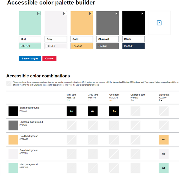
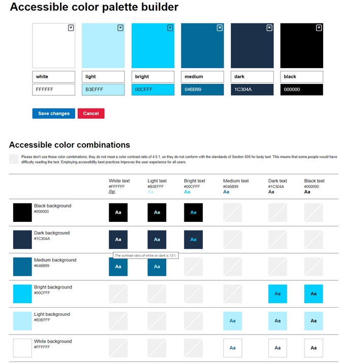
One tool that this guide refers to is the Accessible Color Palette Builder. This tool analyzes up to six colors and creates a matrix of accessible color combinations for the background and text to ensure that the color contrast ratio is 4:5:1. Using this tool is an easy way to check graphics or illustrations, such as maps and presentations, to eliminate barriers for those who have visual impairments and provide a better user experience for everyone.
You only need two pieces of information to use this tool: the HEX color code and the color description or name. When using the tool, the color name/description goes in the top row and the HEX code goes in the bottom row.
In the first example below, the Palette Builder analyzes five colors and the color combination matrix shows six combinations that meet the 4:5:1 color contrast ratio. Meanwhile, in the second example, the Palette Builder analyzes six colors and the color combination matrix shows 16 combinations that meet the 4:5:1 color contrast ratio. The combinations shown in the matrix are the recommended colors to use.
Example 1
Example 2
In our profession, let’s consider what steps we can take to make planning products more accessible. Let’s focus on what can be done today and prepare to build upon that foundation so that information reaches everyone. We must fight the urge to see achieving accessibility as a rote checking of boxes. Rather, it is a journey where we learn along the way.
Accessibility has to be integrated all around—this includes elements such as community engagement in addition to design. Let’s think about how this can be attained in all work products: not just in the design of a landscape, street, or building, but also in print materials and digital communication. Let’s consider how we can make our communication methods more accessible, not just in written or visual communication, but also in how we conduct public meetings. This widens the scope to consider other accommodations such as American Sign Language interpreters and closed captioning.
By addressing accessibility in our work, we also achieve equity by ensuring everyone, regardless of capability, can access the products and services they need. Understanding how to effectively use color contrast is one way to integrate accessibility into the work products that planners develop. This can be one step forward that informs many subsequent steps to further achieve accessibility, and equity, in our profession.

How to Protect Pedestrians With Disabilities
Public agencies don’t track traffic deaths and injuries involving disabled people, leaving a gap in data to guide safety interventions.

America’s 15 Most Accessible Cities
These cities are the easiest to navigate for people in wheelchairs or with mobility challenges.
Opinion: ‘Floating’ Bus Stops Endanger Blind Pedestrians
A design that places bike lanes between bus stops and sidewalks complicates mobility for pedestrians, especially people with vision impairments.

National Parks Layoffs Will Cause Communities to Lose Billions
Thousands of essential park workers were laid off this week, just before the busy spring break season.

Retro-silient?: America’s First “Eco-burb,” The Woodlands Turns 50
A master-planned community north of Houston offers lessons on green infrastructure and resilient design, but falls short of its founder’s lofty affordability and walkability goals.

Delivering for America Plan Will Downgrade Mail Service in at Least 49.5 Percent of Zip Codes
Republican and Democrat lawmakers criticize the plan for its disproportionate negative impact on rural communities.

Test News Post 1
This is a summary

Test News Headline 46
Test for the image on the front page.

Balancing Bombs and Butterflies: How the National Guard Protects a Rare Species
The National Guard at Fort Indiantown Gap uses GIS technology and land management strategies to balance military training with conservation efforts, ensuring the survival of the rare eastern regal fritillary butterfly.
Urban Design for Planners 1: Software Tools
This six-course series explores essential urban design concepts using open source software and equips planners with the tools they need to participate fully in the urban design process.
Planning for Universal Design
Learn the tools for implementing Universal Design in planning regulations.
EMC Planning Group, Inc.
Planetizen
Planetizen
Mpact (formerly Rail~Volution)
Great Falls Development Authority, Inc.
HUDs Office of Policy Development and Research
NYU Wagner Graduate School of Public Service