


A new layer showing the seven-day average of confirmed COVID-19 cases started rolling out to Android and iPhones last week.

Nicole Wetsman reports on a new layer coming to Google Maps that will allow people to keep track COVID-19 infections while navigating the locations of their lives:
Google Maps will soon include information on COVID-19 spread in states, counties, and some cities. Toggling on the “COVID” layer in the app will show the seven-day average number of confirmed cases in each area per 100,000 people. Areas of the map will be color-coded based on case rate, and a label shows if cases are going up or down. The feature will roll out on Android and iOS this week.
According to a blog post written by Sujoy Banerjee, a Google Maps project manager, the new layer will help people to "make more informed decisions about where to go and what to do."
The new COVID-19 map layer pulls data from Johns Hopkins’ COVID-19 dashboard, The New York Times, and Wikipedia, according to Wetsman.
"This is one of many pandemic-related features introduced in Google Maps over the past few months — the app also includes alerts about face-covering mandates on public transportation, information about takeout options at restaurants, and warnings to call ahead to a doctor’s office if you think you have COVID-19," adds Wetsman.
FULL STORY: Google Maps adds an overlay of COVID-19 case trends

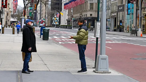
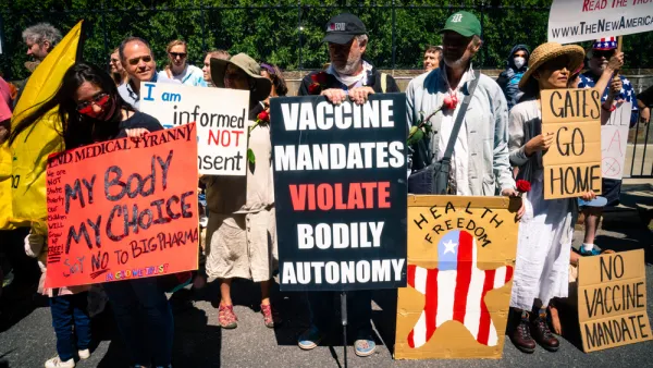
Friday Eye Candy: Covid-19, Then and Now
The New York Times compared images from readers portraying similar scenes in 2020 and 2022.
The Shifting Demographics of Covid-19
For most of the Covid-19 pandemic, Black Americans died at much higher rates than White Americans. That trend has reversed at times during the past year.

Acceptable Deaths
What can we learn from our Covid response?

Analysis: Cybertruck Fatality Rate Far Exceeds That of Ford Pinto
The Tesla Cybertruck was recalled seven times last year.

National Parks Layoffs Will Cause Communities to Lose Billions
Thousands of essential park workers were laid off this week, just before the busy spring break season.

Retro-silient?: America’s First “Eco-burb,” The Woodlands Turns 50
A master-planned community north of Houston offers lessons on green infrastructure and resilient design, but falls short of its founder’s lofty affordability and walkability goals.

Test News Post 1
This is a summary

Analysis: Cybertruck Fatality Rate Far Exceeds That of Ford Pinto
The Tesla Cybertruck was recalled seven times last year.

Test News Headline 46
Test for the image on the front page.
Urban Design for Planners 1: Software Tools
This six-course series explores essential urban design concepts using open source software and equips planners with the tools they need to participate fully in the urban design process.
Planning for Universal Design
Learn the tools for implementing Universal Design in planning regulations.
EMC Planning Group, Inc.
Planetizen
Planetizen
Mpact (formerly Rail~Volution)
Great Falls Development Authority, Inc.
HUDs Office of Policy Development and Research
NYU Wagner Graduate School of Public Service