


A few days ago, I was looking at a regional planning document and saw something startling: an assertion that transit ridership in my region has been going down. Since transit ridership has been going up nationwide, I smelled a rat. After digging around through a big pile of statistics, I realized that there are so many different ways of measuring transit ridership that one can easily prove either that ridership is going up or that ridership is going down. Some possible measurements include:

A few days ago, I was looking at a regional planning document and saw something startling: an assertion that transit ridership in my region has been going down. Since transit ridership has been going up nationwide, I smelled a rat.
After digging around through a big pile of statistics, I realized that there are so many different ways of measuring transit ridership that one can easily prove either that ridership is going up or that ridership is going down. Some possible measurements include:
*Passenger miles traveled. As jobs have moved to suburbs, some transit agencies have had to extend their systems far into suburbia in order to retain ridership. So even if a transit system is weak and stagnant, its riders will make longer commutes, thus causing miles ridden to increase.
*Number of trips. In most cities, the number of trips decreased during the third quarter of the 20th century, as car ownership increased and suburbs boomed. But in recent years, transit improvements and unstable gas prices have caused transit ridership to increase in most cities.
*Market share - that is, measuring transit trips as a percentage of all trips. By this measurement, transit nearly always seems to be declining- because if people are taking more trips by car and more trips by transit as well, transit's share of all trips may stagnate or decline.
So if you want to show that transit is declining, always use the "market share" measurement- and make it the market share of an entire region, so you can include suburbs with minimal or nonexistent public transit (as opposed to central cities where transit and highways compete).
By contrast, if you want to show that transit is and always has been booming, emphasize passenger miles. And if you want to split the difference and honestly show changes over time, focus on ridership.
Similar statistical games can be played with highway transportation. If you want to "prove" that not enough of America has been paved over, compare the number of lane miles built to the number of vehicle-miles traveled. So if lane miles increase 300% in Sprawl City and vehicle-miles increase 400%, you can argue that we haven't built enough roads- even if your region is honeycombed with expressways, every major street has eight lanes, and there is nary a bus or train in sight. Of course, this technique tends to create a kind of unending circle of construction: more highways mean longer commutes from new suburbs that the highways have opened up for development, which means more miles traveled, which in turn can be used to justify more highways.
On the other hand, if you want to argue that America has already been paved to death, focus on the raw number of miles built, or compare lane-miles to population. So if lane miles have increased by 300% in Sprawl City while population has only increased by 50%, obviously the highway lobby is out of control.
In sum, you can prove a lot with numbers- as long as you are careful which numbers to use.

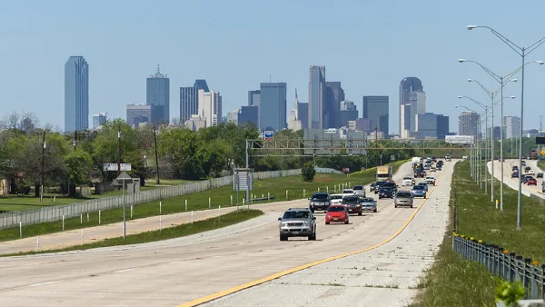
Induced Demand: Why Highways Still Reign in Dallas
Regional planners and Dallas officials aren't confident that the area's highway-centric worldview (and budget) will change anytime soon. The city's competitiveness in the national job market may be on the line.

Charles Marohn: Not Your Typical Urbanist
From his home in Brainerd, Minnesota (population 13,500), this fiscally conservative engineer leads a growing movement. His slow-and-steady approach to urban development has real bipartisan appeal.
Is Turnabout Fair Play?
If American politicans and bureaucrats had favored public transit or pedestrians as aggressively as they favored cars in the 20th century, public policy would be very different indeed.
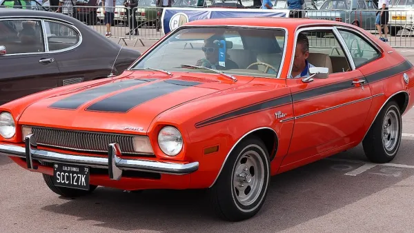
Analysis: Cybertruck Fatality Rate Far Exceeds That of Ford Pinto
The Tesla Cybertruck was recalled seven times last year.

National Parks Layoffs Will Cause Communities to Lose Billions
Thousands of essential park workers were laid off this week, just before the busy spring break season.

Retro-silient?: America’s First “Eco-burb,” The Woodlands Turns 50
A master-planned community north of Houston offers lessons on green infrastructure and resilient design, but falls short of its founder’s lofty affordability and walkability goals.

Test News Post 1
This is a summary

Analysis: Cybertruck Fatality Rate Far Exceeds That of Ford Pinto
The Tesla Cybertruck was recalled seven times last year.

Test News Headline 46
Test for the image on the front page.
Urban Design for Planners 1: Software Tools
This six-course series explores essential urban design concepts using open source software and equips planners with the tools they need to participate fully in the urban design process.
Planning for Universal Design
Learn the tools for implementing Universal Design in planning regulations.
EMC Planning Group, Inc.
Planetizen
Planetizen
Mpact (formerly Rail~Volution)
Great Falls Development Authority, Inc.
HUDs Office of Policy Development and Research
NYU Wagner Graduate School of Public Service