


There's a trend here.
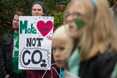
An article by Ronald Brownstein traces the connection between the 2016 political election and carbon emissions. It shouldn't be surprising that their would be a connection between the two, energy and environmental has always been a partisan issue and recently, "Trump has indelibly endorsed the fear that reducing carbon emissions to combat the destabilizing threat of global climate change will undermine economic growth," writes Brownstein.
To counter those fears, Brownstein references Brookings Institution research showing that "since 2000 the United States increased its economic output by 30 percent while reducing carbon emissions by 10 percent." Brownstein takes the next logical step and finds that some states, like Oklahoma and Texas, are still emitting a lot more than others. What's more, "that energy divide now almost perfectly tracks the current political divide."
Comparing the latest federal figures on states’ per capita carbon emissions with the 2016 election results produces a clear pattern. Trump carried all of the 22 states with the most per capita carbon emissions, except for New Mexico, and 27 of the top 32 in all. (Colorado, Illinois, Delaware, and Minnesota were the Clinton-voting exceptions.) The Democratic nominee won 15 of the 18 states with the lowest per capita emissions—with the exception of Florida, North Carolina, and Idaho.
Brownstein adds some demographic and cultural factors to this understanding to determine a very challenging road ahead for the Democrats to recover some of their lost political power ahead of the 2020 presidential election—even if the Trump Administration can do nothing to stem the decline of the carbon economy.
FULL STORY: How Carbon Emissions Explain Trump's Win

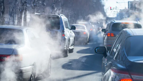
Report: 14 States Increased Per-Capita Carbon Emissions
Many of the states on the list are red-leaning states that fought against federal environmental reporting regulations.

Louisiana Planning Massive ‘Mystery’ Data Center
The center would be powered by a new, 1,500-megawatt natural gas plant, which critics say will drive up emissions and contribute negatively to the region’s air quality.

Report: Some Rural States Ahead of More Urbanized Ones in Reducing Transportation Emissions
This is a largely unintended consequence of states with lower populations and resources focusing on repairing existing roads and infrastructure rather than expanding and building new roads.

Analysis: Cybertruck Fatality Rate Far Exceeds That of Ford Pinto
The Tesla Cybertruck was recalled seven times last year.

National Parks Layoffs Will Cause Communities to Lose Billions
Thousands of essential park workers were laid off this week, just before the busy spring break season.

Retro-silient?: America’s First “Eco-burb,” The Woodlands Turns 50
A master-planned community north of Houston offers lessons on green infrastructure and resilient design, but falls short of its founder’s lofty affordability and walkability goals.

Test News Post 1
This is a summary

Analysis: Cybertruck Fatality Rate Far Exceeds That of Ford Pinto
The Tesla Cybertruck was recalled seven times last year.

Test News Headline 46
Test for the image on the front page.
Urban Design for Planners 1: Software Tools
This six-course series explores essential urban design concepts using open source software and equips planners with the tools they need to participate fully in the urban design process.
Planning for Universal Design
Learn the tools for implementing Universal Design in planning regulations.
EMC Planning Group, Inc.
Planetizen
Planetizen
Mpact (formerly Rail~Volution)
Great Falls Development Authority, Inc.
HUDs Office of Policy Development and Research
NYU Wagner Graduate School of Public Service